Featured Content
-

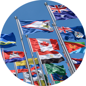
The LLM for Foreign-Trained Lawyers:
Your Bridge to the US Legal System.
Join Our Global Legal Community.
Apply Now
-

Temple Law Rises in 2026 Rankings by
US News & World Report
Read More
-

Thriving in Law: Career Choices, Culture, and Well-Being — A Conversation with Jami McKeon
Register
-

Professor Kristen E. Murray Appointed Interim Kean Family Dean
Read More
-

Temple Law Welcomes Four New Faculty Members
Read More
-
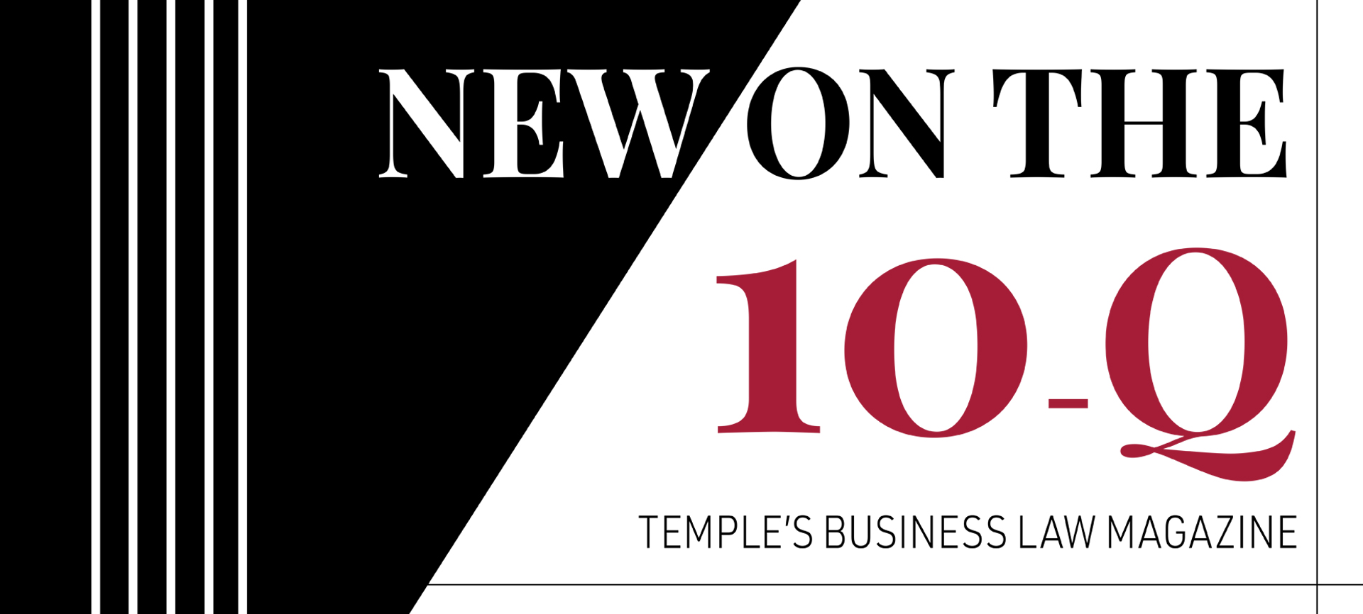
Read the Newest Article from the Temple Law Business Magazine
Read More
The Temple Law Difference